APPLICATION HELP:

ARTIST STATEMENT: (HELPFUL GUIDELINES)
Below are some guidelines to consider when writing your artist statement. We are only looking for a very brief artist statement (a couple paragraphs roughly 250-500 words). It might be the very first time you are writing something like this, but look over these guidelines to get a feel for what an artist statement is meant for.
from Getting Your Sh*T Together: Professional Practices for Artists
https://www.gyst-ink.com/artist-statement/
What Is an Artist’s Statement?
- A general introduction to your work, a body of work, or a specific project.
- It should open with the work’s basic ideas in an overview of two or three sentences or a short paragraph.
- The second paragraph should go into detail about how these issues or ideas are presented in the work.
- If writing a full-page statement, you can include some of the following points:
- Why you have created the work and its history.
- Your overall vision.
- What you expect from your audience and how they will react.
- How your current work relates to your previous work.
- Where your work fits in with current contemporary art.
- How your work fits in with the history of art practice.
- How your work fits into a group exhibition, or a series of projects you have done.
- Sources and inspiration for your images.
- Artists you have been influenced by or how your work relates to other artists’ work. Other influences.
- How this work fits into a series or longer body of work.
- How a certain technique is important to the work.
- Your philosophy of art making or of the work’s origin.
- The final paragraph should recapitulate the most important points in the statement.
What an Artist’s Statement is NOT:
- Pomposity, writing a statement about your role in the world.
- Grandiose and empty expressions and clichés about your work and views.
- Technical and full of jargon.
- Long dissertations or explanations.
- Discourses on the materials and techniques you have employed.
- Poems or prosy writing.
- Folksy anecdotes about some important event in your life.
- Nothing about your childhood or family unless it is very relevant to your work.
- Not a brag fest or a press release.
Why Write an Artist’s Statement?
- Writing an artist’s statement can be a good way to clarify your own ideas about your work.
- A gallery dealer, curator, docent, or the public can have access to your description of your work, in your own words. This can be good for a reviewer as well.
- Useful in writing a proposal for an exhibition or project.
- It is often required when applying for funding.
- It is often required when applying to graduate school.
- It can be a good idea to include an artist’s statement when your slides are requested for review or your work is included in the slide library of a college or university.
- Good to refer to when you are preparing a visiting artist lecture, or someone else is lecturing or writing about your work.
- Useful when you are applying for a teaching position.
- Good idea when a press release is being written.
- Useful when someone is writing about your work in a catalog or magazine.
- Useful when someone else is writing a bio for a program brochure.
- It is a good way to introduce your work to a buying public. Often the more a buyer knows about your work the more they become interested in what you do, and in purchasing a work.
Types of Artist’s Statements You Might Need:
- Full-Page Statement: This statement you will use most often; it speaks generally about your work, the methods you may have used, the history of your work, etc. It may also include specific examples of your current work or project.
- Short Statement: A shorter statement that includes the above in an abbreviated way, or is specific to the project at hand.
- Short Project Statement: A very short statement about the specific project you are presenting.
- Bio: Often a short description of your career as an artist and your major accomplishments.
How Should I Write It?
- This most often depends on the context where it will appear. Who is your reader? What assumptions can you make about their knowledge?
- Emotional tone
- Theoretical (but not over-the-top)
- Academic (but not dry)
- Analytic
- Humorous
- Antagonistic
- Political
- Professional
- Ask yourself “What are you trying to say in the work?” “What influences my work?” “How do my methods of working (techniques, style, formal decisions) support the content of my work?” “What are specific examples of this in my work” “Does this statement conjure up any images?”
- Use a word processor so that you can make changes and update it often. You should keep older copies so that you can refer to them if you should need to write or talk about your older work or if you have a retrospective.
- Refer to yourself in the first person, not as “the artist”. Make it come from you. Make it singular, not general, and reflective of yourself and your work.
- Make it clear and direct, concise and to the point.
- It should not be longer than one page.
- Use no smaller than 10 – 12 point type. Some people have trouble reading very small type.
- Artist’s statements are usually single-spaced.
- Do not use fancy fonts or tricky formatting. The information should wow them, not the graphic design.
Considerations:
- Who is your audience? What level are you writing for?
- What will your statement be used for?
- What does your statement say about you as an artist and a professional?
Style:
- Be honest.
- Try to capture your own speaking voice.
- Avoid repetition of phrases and words. Look for sentences that say the same thing you said before, but in a different way. Choose the better of the two.
- Vary sentence structure and length. The length of a sentence should relate to the complexity of the idea.
- Organization of detail is important. Significant ideas should be at the end of each sentence for emphasis.
Where Should It Go?
- In a binder at the front of the gallery with your résumé, list of artworks, and past reviews or articles about your work.
- You may want to hang it on the wall, regular size, or enlarged as a didactic statement.
- Include it in a program for performance, screening, or panel.
- In the application package of the grant you are applying for.
- Give to anyone who you feel would benefit from the information.

EXHIBITION DESCRIPTION: (250-500 words)
Distinct from your Artist Statement, your Exhibition Description is a rough description of what you plan to exhibit in the gallery. Your proposal for an exhibition could range from a collection of the best from a series of work, or your recent experiments in a new material or idea. Explain your plan in clear and direct language. Not everyone makes similar work or knows what your work is like, so describe your plan as you imagine it to exist, and to someone who doesn’t know you.
Consider: What do you imagine your show looks like upon first walking in? What do we see? Is it an exhibit of drawings in frames on the wall? Are you installing ceramic vessels on pedestals? Video projection on the wall? An installation of folded paper in one corner of the room? Sixty televisions playing Adam Sandler films? Three performers reading from an installation of stacked telephone books? etc. WHAT IS IT??
Here is a made-up example of the beginning of an Exhibition Description:
“I have been making these colored pencil drawings all year, and now am thinking about how the marks I am making translate onto the structure and glazing of ceramic forms. I have started a few and am excited by the direction they are headed toward. I hope to have around twenty of them by next fall and would like to show them along with the drawings that they were inspired by. I have submitted 10 images of the drawings, and 2 of the recent ceramic forms as an example of what they will ideally resemble.”
It is not necessary to know the exact details of everything in a future project, but instead a rough but thoughtful plan of what you have in mind in terms of interests, research, and materials. OF COURSE, the exact details are likely to change as your work progresses and your show date approaches, but what is important is that the central idea stays similar to the original plan, and that your proposal seems possible, plausible, and reasonable to the selection committee. A well-drafted Exhibition Description will also have a logical connection to your Artist Statement. OF COURSE, we do not expect all of the work to be completed already, so if your images and description do not exactly correspond, include a note to explain. “This earlier work contains similar ideas or materials, and is submitted as an example of my work ethic or direction”, etc.
Previous Exhibition Proposal examples:
Nathan Clark
My intended exhibit is a 4-minute video installation entitled “RIDE OR DIE.” This piece utilizes manipulated found footage from the Fast & Furious films, one of the most enduring and ever-popular of modern American movie franchises. The Fast & Furious films have fascinated me for years; the first entry in the series was made before 9/11, and the entire franchise seem to exist in an alternate timeline in which the events of that day never happened and the multiracial rave of the 1990s never ended. These films are predicated on a tension between reality and fantasy, between the infinite bodies of action stars and the expendability of the machines they operate. The tension between these two modes turned tragic on November 30, 2013, when Paul Walker passed away in a car accident. Despite the durability of his on-screen persona, Paul Walker’s death proved that his real body was all too mortal.
“RIDE OR DIE” opens with a selection from Dziga Vertov’s “WE: Variant of a Manifesto,” published in 1919, which praises the dependability of machines and proclaims that man is an unsuitable subject for film due to his inability to control his own actions and movements. The piece then uses six video panels to chronicle the on-screen relationship between Dominic Toretto (Vin Diesel) and Brian O’Connor (Paul Walker) as the two men race each other and rescue one another over and over again on a last ride that, thanks to cinema, can extend into infinity. As Dominic continues to age and live on, Brian progressively fades until the details of the footage in his panels are almost impossible to make out. This fictional friendship is pulled back to reality by the appropriation of Vin Diesel’s homemade cover of the Rihanna song “Stay,” which functions within the piece as a form of narration. We are reminded that, despite our ability to replay and re-watch movies, our own memories are forever fading out. Vin and Dom both sing to their fallen friend, who exists within movies but is no longer with us in reality. The footage and music loop continuously as the audience follows along, reliving cinematic memories while confronting their own perceptions of celebrity death and reckoning with the false invincibility of action heroes. Screenshots from the film will accompany the projection on the surrounding walls.
Byeol Shim
My Strange Things exhibition will include a combination of figurative clay sculptures and paintings. Clay sculptures will be exhibited in the middle of the gallery, and paintings will be hanging on both walls surrounding the sculptures. Because the paintings are much larger than the clay figures, I hope to create a strange environment that will let the audience sympathize with the clay figures while they share the same space. There will be approximately 8 paintings and 2-3 clay pieces, and most of the artworks for the show will be mixed media. One of my clay pieces, “It was just a passing shower,” is composed of nearly 300 individual figures, and is glazed with various colors in order to show a wide range of personalities. Most of my paintings, on the other hand, are in acrylic in a brighter color palette. Overall, I imagine an engaging space that combines 3-dimensional and 2-dimensional work.
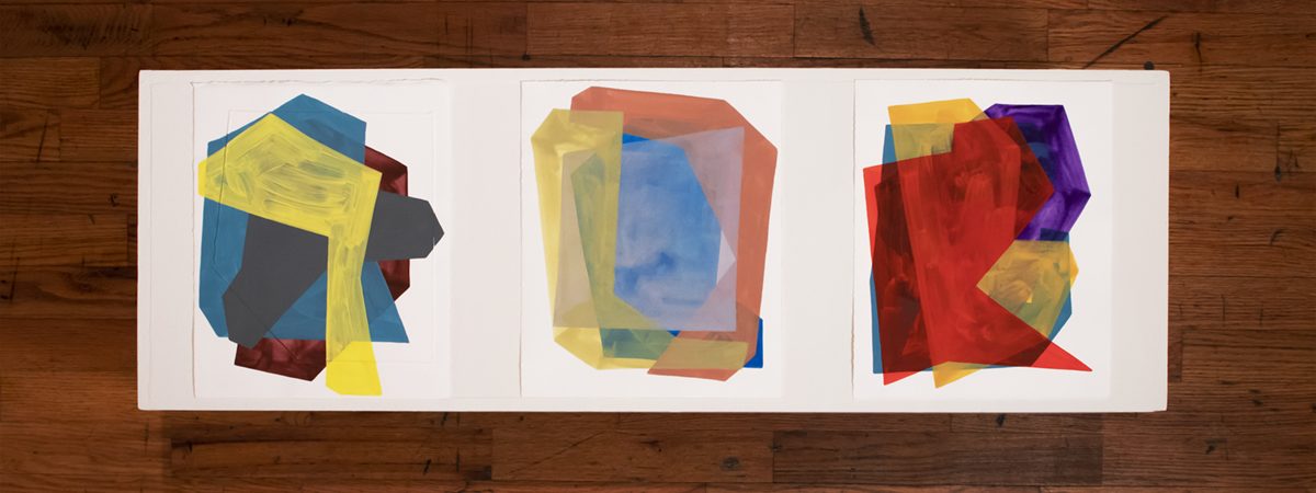
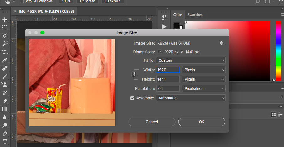
For the Artwork Samples please create a Google Slides presentation that is DOWNLOADED as a multi-page PDF. These images are meant to represent the work that would be exhibited. We understand that the work for the exhibition may not be made yet, but we would like to get an idea of each artist’s current practice. Please label this pdf as: LastName_FirstName_Images.pdf. Please upload this single PDF with a maximum file size of 1GB that contains the following: your name and the exhibition title on the first slide, EXACTLY 10 digital images of your work that are clearly labeled on each slide with the following information: title (in italics), date of completion, medium, and dimensions (a link to view time based work may follow this). For group or curatorial shows please provide at least 1 image per artist. All digital images must be in jpg format, 72dpi and sized 1200 pixels on the longest side. For time based work please include a still image on the slide and add the video or audio file as a link alongside the label information. (This requires that all time based work is uploaded to Vimeo or Youtube prior to submission.) The committee will only view the first two minutes of any time based work. Submitting excerpts of longer works is recommended.
EXHIBITION HELP:

You will be responsible for all aspects of your show, we’re here for support and advice, but again we’re getting you ready for the real thing. It’s good to start preparing yourself for the work ahead. Exhibitors are responsible for the following:
- Creating, printing, and distributing promotional materials for the show.
- Designing, ordering, and hanging vinyl lettering on the gallery wall.
- Preparing the work for exhibit. (i.e framing, info tags, etc.)
- Securing all equipment required to show the work.
- Installing the show.
- Attending your opening reception and greeting visitors.
- Opening the gallery at 10am and closing the gallery at 1pm on Saturday.
- De-installing the show and cleaning the space.
- Documenting the show, and editing the images/video.
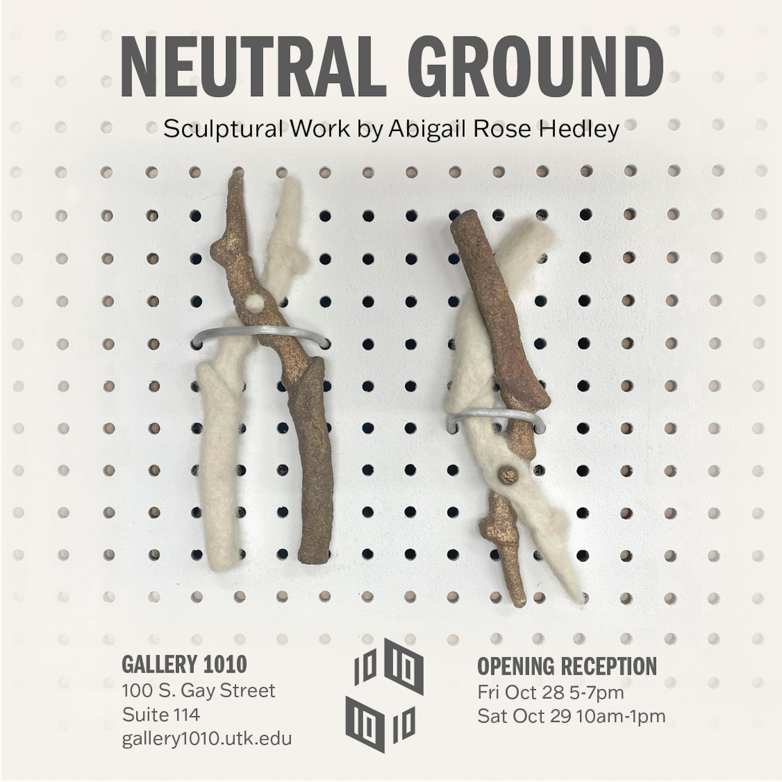
Download the zip drive below containing an Illustrator template (Tabloid Poster, Postcard and Digital Poster announcement (to submit below)) Fonts, and design instructions.

Submit Digital Poster
Exhibitors must submit a digital poster of their show using the Gallery 1010’s provided template at least 2 weeks in advance of their show. You must use the gallery’s template to make your promotional image, see above to download template and instructions. This will be used for the gallery and the School of Art to promote your show. Digital poster MUST be 1000 x 1000 pixels and 72dpi. To assure that you have successfully submitted this form please scroll back down to this form and check the message. It will either thank you for submitting the form or you will be notified of an error you must fix and then resubmit.

Each artist/exhibitor is required to promote her/his exhibition at least two weeks in advance. This helps to bolster the online presence of the gallery and to ensure that the space retains a vibrant presence in the Knoxville community.
Promotion must include (but is not limited to) registering your show on the following platforms:
– Post on the Gallery 1010 Instagram
–More to Knoxville (submit events to info@knoxalliance.com)
–Printed Posters and/or postcards (can be printed at Ucopy in the Student Union, online at VistaPrint, or a printing center of your choice).
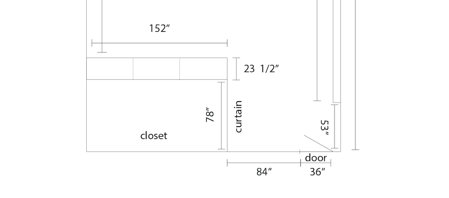

All gallery-owned equipment MUST remain in the gallery.
If we are missing or running low on something, please email the gallery at
Notes about the space:
Heat/air conditioning.
Password protected Wi-Fi.
Lighting:
Removable LED lights.
Removable/adjustable track lighting.
(2) Plug-in Clamp Lights
Replacement LED light bulbs
Tables/Chairs/Pedestals:
(7) Chairs
(2) 8ft Tables
(1) Desk on wheels (Dimensions: 45″x 19″x 27 1/4″)
Pedestals (HxWxD)
(1) 42 1/2″x 19 1/4″x 16 1/4″
(1) 32 1/2″x 18″x 18″
(1) 42 1/2″x 14 3/4″x 14 3/4″
(8) 36″x 12″x 12″
(1) 36″ 12 1/4″x 12 1/4″
(1) 30″x 12″x 12″
(1) 24 1/4″x 12″x 12″
(1) 11 3/4″x 11 3/4″x 11 3/4″
(1) 18″x 12″x 12″
(2) 12″x 42″x 6 1/4″
Install Equipment:
(1) 8′ ladder
(1) 6′ ladder
(1) 2′ step ladder
(3) Flat loading carts
(2) Power drills – One corded and one battery powered.
Various screw driver bits.
(2) Hammers
(2) 24″ Levels
(2) Tape measures
(2) Rulers – (1) 12″ and (1) 18″
(1) T-square
(2) Spring Clamps
(2) Screw Drivers – Phillips and Flathead
(1) Vinyl Squeegee
(2) Scissors
Screws and miscellaneous hardware
(1) Roll of Fishing Line
Assortment of Binder Clips in Various Sizes
(1) Box of T-Pins
Various Thumb Tacks
Extension cords of various lengths.
1″ Painters Tape
1″ Masking Tape
2″ Packing Tape
3″ Packing tape
#2 Pencils with Erasers
(1) Pencil Sharpener
Black Fine Point Sharpies
Dry Erase Markers for the Sidewalk Sign
(1) Large Eraser
(1) Xacto Knife with blades
(1) Razor Scraper with blades
Cleaning/repairing supplies:
(1) Dyson Vacuum
(1) Push Broom
(2) 8″ Brooms
(1) Mop with Bucket
(3) Extra Industrial Cotton Yarn Mopheads
Murphy’s Oil Soap
(2) Wet Floor Signs
(1) Dust Pan
(3) Hand Brooms
Gallery Specific White Paint
(2) Paint Can Openers
9″ Paint Rollers
(1) Paint Roller Handle
(2) Paint Trays
DryDex Dry Time Indicator Spackling
(3) Spackle Knives
Sanding Blocks
Various Sand Paper – 150 Grit
Drop Cloths – Plastic Roll Type (1 roll) and Fabric (2)
Windex
Simple green
Disinfectant Spray
(1) Box of Latex Gloves
Cleaning rags
(3) Scrub Sponges
Trash Bags
Kitchen:
(21) 8oz Mason Jars
(17) 5 1/2″ plates
(10) 6 1/2″ plates
(1) 7″ plate
(1) Soup Spoon
(1) Ladle
(1) 6″ White serving bowl
(3) 12″ Plastic serving bowls
Dish Soap
Dish Sponges
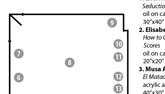
Use this illustrator template to create a map for your visitors to best find out details about your artwork.
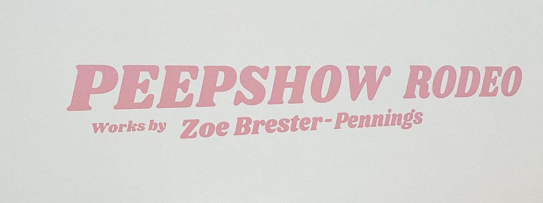
All exhibitors are required to install vinyl lettering on the wall of the space during their exhibition. The lettering must contain at least the exhibitors name(s) and show title, but could have more (i.e. curatorial statement).
To start create an illustrator file of the text you want printed. Make sure the document size and layout is the same size and layout you’d like the vinyl lettering to be. You may use this prefab illustrator template to create your file. Instructions included in the zip file. Vinyl Template and Instructions
We recommend you use the School of Art SmART Lab in the Art and Architecture Building Room 455 to print your file on vinyl yourself. Make sure you stop by the Lab during open hours or schedule an appointment at least 2 weeks in advance of your show. SmART Lab.
Alternatively, you can order vinyl from Allen Sign. Please note they require a week of lead time, and will be more expensive. Past exhibitors have paid $20-$30 for their vinyl signs. Illustrator files can be emailed to sales@allensign.com

Submit Documentation Images
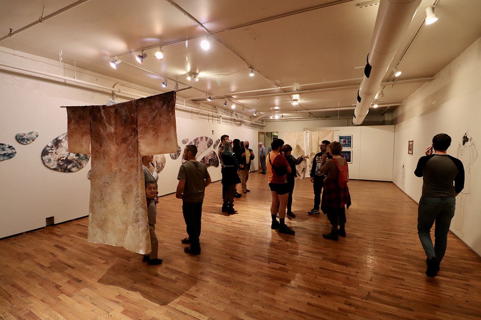
Every Exhibitor is required to submit at least 5 images of the documentation of their show. You may submit up to 10. The images may be of the installation and/or during the reception. They must be no larger than 1200pixels on their longest side, and must be 72dpi, formatted as .jpg or .png files. These will be used by the gallery and the School of Art to keep an archive of all the shows that have happened at the gallery. Additionally please list all of the artists who exhibited and provide links to their websites, although this is optional.
